Monday, September 14, 2015

Canberra Glassworks

 
After much procrastination I finally went to visit the Canberra Glassworks and Old Bus Depot markets in Kingston, ACT. A big day out as it took me an hour to get out of central Canberra - no signs to anywhere but ACT suburbs and so did the loop a few times.

Canberra Glassworks is well worth the visit. The 'Engine Room', hotshop and artist's benches are 'open' to the public and seeing artists at work is always good. Here it is so much better than Murano in Venice. Highlights were talking with Matthew Curtis and saying 'hello' to Klaus Moje!!

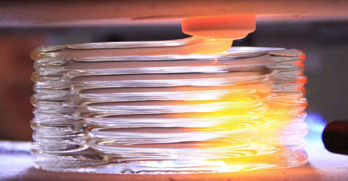
The current exhibition is 'The Distant Warriors "Ka maumahara" (we will remember). Let us not be forgotten.' featuring glass and textiles inspired by the stories of indigenous and Maori soldiers. The artists are all indigenous or Maori and the glass poles or columns shown above were the best pieces.

The second from left column is by Jennie Kemarre Martinello who is a very talented and successful textile/print/glass artist. Her main works are dill bags or fish traps made from glass murrini. Very delicate and quite beautiful. I bought a paperweight that she makes from left over murrini.

Bottom

Top


I also bought a medium sized plate by Kate Baker (a favourite of mine) that has a screen printed image on clear. She uses a lot of images and text and almost always screen prints on to the glass.
She does teach at her studio in Surry Hills (?) but her courses are expensive for what is after all a $60 plate. If she ever teaches printmaking techniques though I would willingly spend the money.


Detail


Oh and the Bus Depot Markets....okay but nothing special or different. It was quite busy though so may be worth applying to have a stall one Sunday a month. Watch this space!


Wednesday, September 9, 2015

Desk Screen


One man's trash is another man's treasure - I found this screen designed for photographs and made some panels out of Spectrum 96 (7 large and 4 small rectangles). Fully open it measures 60 x 45 centimetres and looks spectacular with light flooding through. A piece of contemporary stained glass.

Perfect for someone's desk and hopefully it will sell at the Rose Bay Fair in October.


Monday, September 7, 2015

Shoalhaven Quartet


Inspired by Arthur Boyd and his Shaolhaven River series I used my first vitrigraph pieces to make four "Shoalhaven" plates......If only I could get the Bundanon Trust to put them in the Homestead shop!? I will enter them in the Divine Glass calendar competition though later this month.


Boyd - ShoalhavenQuartet

Tuesday, August 25, 2015

Glass 3D Printer

https://vimeo.com/136764796

http://matter.media.mit.edu/news/article/glass-printing-from-mediated-matter1


I thought originally that this was a spoof or April Fool's Day hoax but it seems to be real! Very cool!!

"How hot does your 3D printer’s hot end get? Most low cost printers heat up to 240°C (464°F) at the most because they contain PEEK which starts to get soft if you go much higher. Even a metal hot end with active cooling usually won’t go much higher than 400°C (752°F). Pretty hot, right? MIT's new G3DP printer goes to 1900°F (over 1000°C) and prints optically clear glass.

By changing design and print parameters, G3DP can limit or control light transmission, reflection and refraction. The printer uses a dual heated chamber. The upper chamber acts as a 1900°F kiln while the lower chamber serves to anneal the structures. The print head is an alumina-zircon-silica nozzle.

There’s a patent filed on the process, apparently, and you can read the technical details in this thesis

http://web.media.mit.edu/~neri/MATTER.MEDIA/Theses/John_Klein_MIT_MSc_Thesis_Submission%20%281%29.pdf 

and in some upcoming publications"


Apparently you could use Spectrum 96 or Bullseye 90 nuggets as the glass source so maybe one day....when the G3DP printer is less than $10,000!

Monday, August 24, 2015

Ted Sawyer


The Bullseye Resource Center (sic) recently published a video showing how Ted Sawyer produces his ethereal glass panels. I do like Sawyer’s work so thought I would see whether it was possible to reproduce.

Sawyer’s technique is essentially to sift layers of transparent glass powder onto clear sheets of glass and manipulate the powder with water, Glastac and clay modeling tools. He uses a lot of powder, a lot of layers and works on both sides of large 1m square panels so they need to be fused twice.


My first attempts were more modest – four colours on one side of 18cm square glass. My thinking was that if they did not work as panels I could slump them to make sushi plates. Two panels were disappointing and the other two (beach and nebula below) I framed in box frames with two cut mounts rather than a backing board. This means they can sit with a window or light source behind to show off the layers and texture.


The idea behind the technique is to create abstract patterns not only of colour but also of texture and transparency. There is nothing particularly hard about the techniques but it is the visualization of the finished effect that sets Sawyer apart.


The most fun was dropping water from a height onto the powder to produce craters that were then filled with another colour. I have to say that if that was the highlight then I wont be producing many more!


The other ‘problem’ is the long fusing schedule – almost 24 hours. Admittedly the schedule is recommended for a 1m square sheet but with a highest temperature of 693°C it is somewhat short of a full fuse. This means that some of the texture is preserved but because the powder does not fully fuse some of the transparency itself is lost.


I know that I am not as gifted as Ted Sawyer but I would rather run a kiln full of pattern bars or work 6 layers deep if it is going to take 24 hours.

Vitrigraph - Fun with Molten Glass


I added a Skutt Firebox kiln to my studio a while ago for hot combing and vitrigraphy but have only recently found a suitable stand for the latter. I had thought of using two tables and some concrete blocks to raise the kiln up but it was never going to work in my studio (ie the laundry!!)


Finally I bought a set of stainless steel shelves from Brayco. The uprights are 1.8m and the kiln sits on a shelf 1m above the ground. The central section of the shelf is cut out to allow the glass to fall onto a second shelf holding a stainless steel bowl.


The kiln base is removed and placed on a piece of 2.5cm fibre board with a 2cm hole cut in the middle. The scrap glass is cut into 2cm squares and put in a 15cm terracotta pot (the expensive Italian one) and the pot is put on two mullite strips to raise it off the fibre board. For the first run I did not enlarge the (drainage) hole in the pot but it might be worthwhile for the future.


I chose to use an ultra conservative firing schedule – 


1 hour to 320°C

4 hours to 740°C

1 hour to 1040°C at which point glass began to flow.


The Firebox doesn’t have a programmable controller and the ‘heat’ switch is described as ‘infinite’. That means at setting 1 ½ the element heats at about 180°C per hour and 300°C at setting 4. The switch design means a lot of trial and error and I figured I would rather go slow and steady to avoid stressing the terracotta pot more so than the glass.


Recommended schedule is 250°C per hour to 940°C (about 3 ¾ hours). The thermocouple pyrometer though is reading from close to an element and the glass in the terracotta pot is insulated. Next time I will try to try 250°C per hour for 4 hours and see what happens.


When the temperature reaches 940°C the glass is molten and starts to flow through the pot’s hole. The temperature has to be raised and lowered to get the glass streamers to thicken and thin. I used some steel salad servers to manipulate the streamers and scissors to cut the flow. The streamers fall into the steel bowl filled half full with vermiculite. The streamers don’t need to anneal but the vermiculite gives some insulation to slow the cooling somewhat.


The great things about a vitrigraph kiln are that you can make customized elements for use in other work and use up scrap glass in any colour combination you like. I used Spectrum 96 white, cream, grey and pink as I wanted to produce elements that resemble ghost gum bark. It is also a way of using a kiln to replicate what is usually done in a hot glass studio so you can produce rods, stringers and murrini rods.


So, all in all a great trial run and I will definitely be doing it again.


One technique for the future would be to let the molten glass to flow straight into a steel bucket of cool water. The glass should fracture from heat shock and create customized colour combination frits.

Monday, May 11, 2015

Schiele's Portrait of Anton Peschka

Egon Schiele (1890 – 1918, Vienna) was a master of figural distortion and boldly defied what conventional views were of beauty. He was the leader of the Austrian Expressionists and his portraits are quite extraordinary – laying bare his own and his sitters’ psyches and showing unprecedented sexual and emotional directness.

He was prolific during his short and notorious life that was often scandalous even by today’s standards. He produced over 3,000 drawings and was a fabulous draughtsman. His primary influence was Gustav Klimt (he will be an artist I will revisit later in the year) who also acted as friend and mentor. Klimt was exotic and colourful in his art; Schiele used a limited palette and a graphic (design) style well ahead of his time.

Schiele died in 1918, not in the war but from the Spanish Flu epidemic that claimed his wife three days before his own death (and 20 million lives overall in Europe). Schiele produced half a dozen drawings of his wife after she, and before he, died.


The work I have tried to interpret is “The Portrait of Anton Peschka” (shown above) – a beautiful portrait and easily mistaken for a Klimt. Anton Peschka (1885 – 1940, Vienna) was a friend of Schiele’s and married his sister Gertrude. He exhibited regularly from 1906 to 1935. I love the muted pinks and grey palette and the Art Nouveau details on the chair. I hope I have done the work some justice and have used iridescent silver-grey glass for the background and chair. and a (very expensive piece of) neo-lavender for his coat. My piece is shown below and measures 20 x 29 cm unframed. It is much closer in tones than this awful photo shows!


Thursday, April 30, 2015

Simplifying Sharaku


After Vermeer let’s go for something from the 18th century – not from Europe but from the Japanese Edo Ukiyoe – The Floating World of samurais, geishas and Noh actors.

Tôshûsai Sharaku was one of art history’s most fascinating figures and appeared on the Ukiyoe printmaking scene like an alien from outer space. He produced an astonishing body of work in a very brief ten month period in 1794-95. The number of works was also small – if each sheet produced were counted separately then the total would be 145 known individual sheets. 

Finding the real Sharaku has long been a matter of controversy and, so far, he remains unidentified. One theory that he was an Osaka based Noh actor who visited Edo (Tokyo) appears to be the most plausible. As quickly as he appeared he sank without trace. One possible explanation for this is the radical and caricature-like way in which Sharaku displayed the actors. It might have been regarded as offensive towards them and their fans. Sharaku prints were so much out of conformity that they apparently did not sell well. The public wanted idealized depictions of their favourite actors instead of exaggerated but truthful portraits. The combination of a hostile art scene, a bad commercial outcome and an artist who was not willing to make any compromises, sounds like a plausible theory for his mysterious disappearance.


Sharaku's prints were descriptive and the expressions of the actors are extremely vigorous and exaggerated - close to caricatures. The Sharaku prints seem like a snapshot catching the character, the mood and momentary emotions of the actor. The designs reflected not only what was seen on the surface but also empathized with what was being felt by both the actor as a real person and by the stage character he was performing. The most expressive of his portraits were more complex psychologically than were the portraits of his contemporaries. Remember also that the actors were all male so some of Sharaku’s women portraits, above left, are hinting at sexual duality.

We can also observe Sharaku's use of bold, thick lines for the eyes, eyebrows, and mouth, in contrast to the thin, delicate lines of the remainder of the face. So for this interpretation I have focused on the eyes and eyebrows of the Sharaku actor, above right, and his sensational profile. I was lucky too see, at the Japan Foundation in Chifley Tower, an exhibition in 2004 of works celebrating the 200th anniversary of Sharaku’s brief but explosive career. The art works were mainly by graphic designers and my interpretation of Sharaku is heavily influenced by their style. Here is my finished Homage to Sharaku measuring 20 x 30 cm.


Tuesday, April 28, 2015

Reworking the classics - Vermeer

"Good design is simple; that's why it's so difficult"
Paul Rand

My latest project is a reworking of some Old (and New) Masters. Having completed over 30 glass ‘drypoints’ for sale at the Paddington Art Markets I wanted to try something a little bit different.
The plan is to simplify well-known paintings by well-known artists and create the whole, or a detail, in fused or copper foiled glass. It will be a challenge to change a piece of art everyone recognizes and simplify it, using mainly straight lines, into a workable image. It will almost end up as a cartoon.

I should say at this point that while I am ‘appropriating’ all the works I will fully ‘attribute’ the artist’s original work. I am not trying to ‘copy’ anything; rather I am trying to interpret and create a ‘new’ work in the medium of glass.
Let’s remember now that I am not a trained artist let alone having any graphic design background. However, I hope my technical expertise and imagination will get me through.


Each piece will be framed and accompanied by an image of the original work, some biographical notes about the artist and some technical notes about how the pieces were made.


So, where to start? I debated whether I should begin at A and work towards Z or whether I should start with Lascaux cave paintings and move on chronologically. In the end I am going to kick off with an artist who I have long admired and who was under appreciated for 200 years. I also have a friend who can trace his family line all the way back to Vermeer in 1665 so he might even buy the piece!


The artist is Jan Vermeer, born 1632 and died 1675 in Delft, the Netherlands. He studied under Carel Fabritius (Rembrandt’s most inspired pupil) and entered the art Guild of St Luke in 1653. He was largely ignored during his life and died heavily in debt leaving a widow and 11 children. His genius was rediscovered in 1860, not least by the Impressionist dealers the Frères Goncourt, and there are now about 40 works attributed to Vermeer. Most of them are beautifully posed interiors with self-absorbed people and his handling of side light and shadows is masterful.


Having chosen Vermeer then I figured I might as well start with probably his most famous work – The Girl with the Pearl Earring - most famous because of the Colin Firth and Scarlet Johansson movie.


Vermeer was a great artist but even now some historians are critical of his work because he used a camera obscura that allowed him to project the subject image onto the painting surface. Critics say that this is ‘copying’; I think it is revolutionary innovation for his time. Vermeer’s painting techniques were to layer thin glazes of colour to build up light and shadow, broad areas of flat colour underpainting and ‘alla prima’ (a painting technique in which layers of wet paint are applied to previous layers of wet paint).

Now to the simplification and appropriation. I am looking for strong shapes that I can block out with straight lines so that it can be adapted for glass. First thing to do is to focus in on the face, turban and earring. This means losing her right eye and beautiful profile – my thinking is that to square off her face would lead to a worse compositional outcome. Then block out the main areas of colour so that it will still look like the girl and select the glass to match those colours.


I am using Bullseye glass for this piece though ordinarily I would choose Spectrum because it is smoother and easier to cut cleanly. Having cut all the pieces – just like for a stained glass window or a wooden marquetry work – they are then assembled with a layer of clear on top. 


Into the kiln for a full fuse (up to 810°C) and 24 hours later here is the finished piece before framing. It measures 210 x 210 mm square and framed it will 280 x 290 mm. I could have cut a little more precisely and taken a better photograph but the iridescent black background works really well and I am pleased with the skin tones.


Tuesday, April 14, 2015

Glass 'drypoint etchings'


Geisha (after Karhu)

I have been using ‘liquid glass’ paints for a while and really like their colour range and versatility. I use them to create ‘glass drypoint etchings’ where the fusible glass paint is applied as a line to resemble an etching. It’s a great way to combine fused glass with printmaking though I admit it is more of a drawing technique. My techniques are certainly not unique but I have not seen any other artist create framed glass art in exactly this way.
This is not glass painting though –it is still kiln-formed fused glass. The first glass artist to make ‘liquid glass’ was Richard la Londe who mixed glass powders into CMC (carboxy methyl cellulose) and then applied it using a small bottle or a cake-icing bag. His technique was then to fill in the outlined space with frit and powders to create a picture.
‘Glassline’ and ‘Colour Line’ paints are ready to use glass enamels where the enamel is suspended in a paste/medium that allows them to be applied as a lining and shading material for glass art. They're easy to use, can be thinned with water and come with a metal tip set, recommended for fine line drawings on glass. The colour range is impressive – over 30 colours - and because they can be blended and diluted there is a lot of room for experimentation.
They can be applied between multiple layers of glass (any COE including float glass), on the top surface for a complex dimensional look, sprayed using an airbrush kit to achieve subtle shading variations on glass, applied using a brush and in printmaking (screen and relief). If the glass has been sandblasted or engraved (say with a Dremel diamond tool) then the paints can be used just like etching inks. This is really a modified vitreograph (the artist uses 10mm thick float glass as the matrix and etches into the glass surface then prints with etching inks) where a one-off fused piece is made.
These glass ‘etchings’ were created using fusible Glassline paint and two layers of Spectrum 96 glass. The piece was full fused to 810°C and then framed in a recycled frame for display at home or work. This is a unique and affordable piece of glass art created and handmade in Australia.
If you have a photograph that you would like to have as a glass ‘etching’ then get in touch and I will happily create it for you.


Venice III - Grand Canal